Sports aux Puces
Sports aux Puces is a Canadian sporting goods retailer selling both new and used equipment. What makes them different is their "second cycle" program — quality used gear at better prices, for athletes and families who want value without compromise. The project was a full e-commerce redesign on Shopify: 18 pages, bilingual French and English, built around one goal — making it as easy as possible for the right customer to find the right product and buy it.
Role
UX Wireframing, UI Design, Shopify E-commerce Design

The problem with the old site
The previous site made it hard to find products, the navigation was counter-intuitive, and the experience didn't reflect the quality of what the store actually carries. For a retailer with a large inventory spanning multiple sports, seasons, and equipment types, poor product discovery isn't just a UX problem — it's a revenue problem. Every extra click between a visitor and the product they're looking for is a reason to leave.
Design decisions for discovery
The catalog covers hockey, cycling, fitness, ski, and more — new items and used ones, each with different variants. A hockey stick alone has size, flex, curve, and side to choose from. Getting that right on a product page isn't just about layout; it's about making the decision easier, not harder.
The design focused on three things that directly affect whether someone buys:
Advanced filtering on collection pages, so visitors can narrow down by the variables that actually matter to them — not just category, but size, variant, and sport-specific attributes. A mega menu structured around how customers think, not how the inventory is categorized. And product pages built to handle complexity without feeling complicated — detailed variant selectors, clear pricing, and enough information to make a confident decision.


The product page as a selling tool
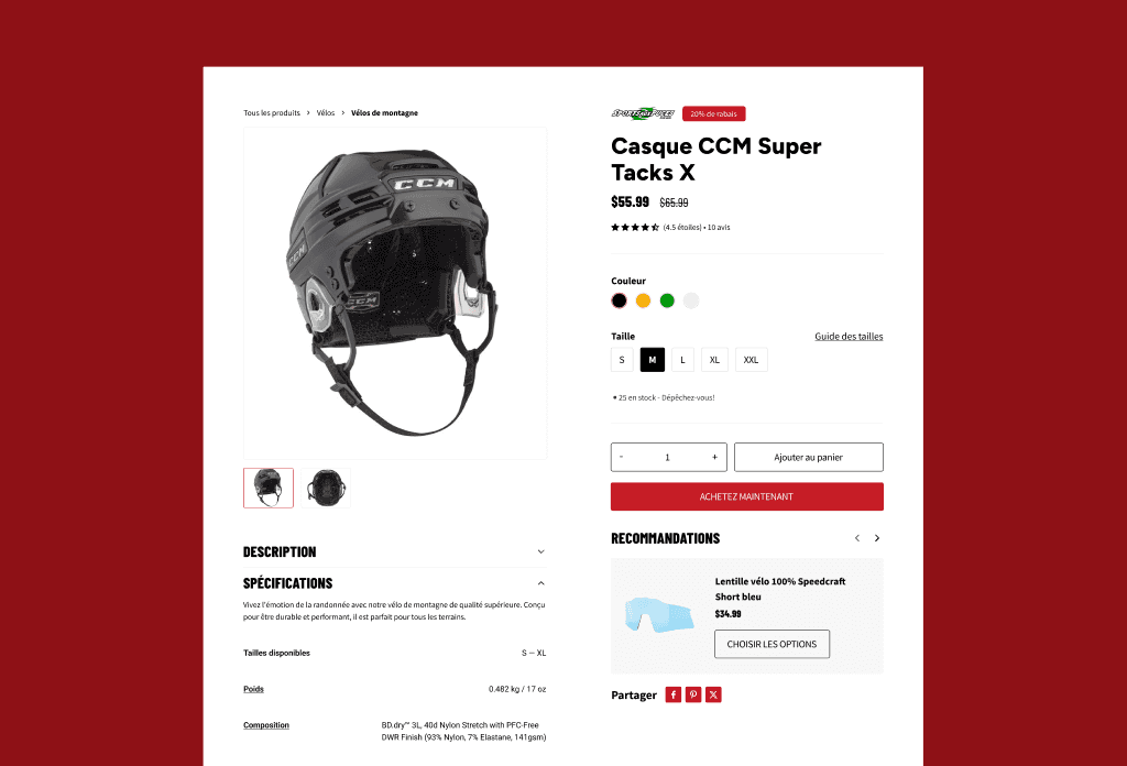
The product page had to do more than display a product. On an e-commerce site, it's where most purchase decisions are made or abandoned — so every element on it has a job to do.
Alongside the add-to-cart and buy now buttons, a recommendations card surfaces a relevant complementary item without interrupting the flow. The intent is to increase order value at the moment a customer is already committed to buying, not after. Below the fold, a related products row keeps browsing open for anyone who hasn't decided yet.
Variant selectors for color and size are prominent and clearly labelled — with a size guide link for categories where that matters. The specs section and shipping/returns information are tucked into accordions so the page doesn't feel heavy, but the information is there for customers who want it before buying. Customer reviews sit further down the page with a rating breakdown, giving social proof to anyone still on the fence.

18 pages, two languages
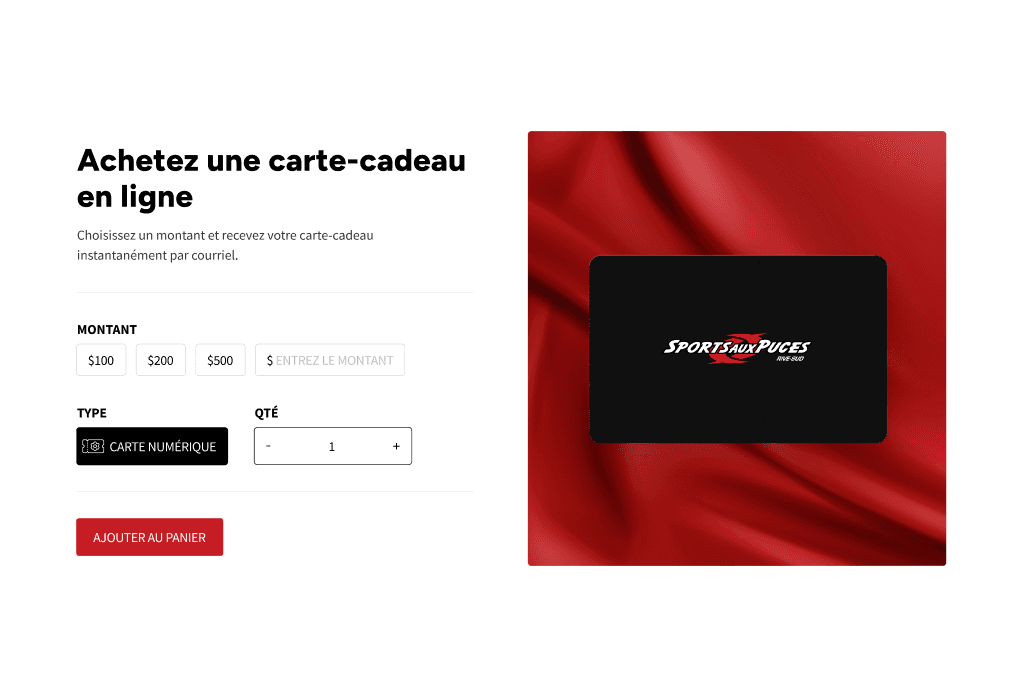
The full scope covered 18 pages: homepage, shop, product, services, seasonal rental pages (summer and winter), maintenance and repair, buyback and exchange program, gift cards, loyalty program, blog, and legal pages — all designed in French first and adapted for English. Every page had to carry the same visual system and level of detail, from the highest-traffic product pages to the simpler informational ones.
The process started with approved wireframes for every page before any visual design began — which kept the structure decisions separate from the visual ones and made the feedback process significantly cleaner.




The result
A complete Shopify e-commerce design across 18 pages, bilingual, built on the Enterprise theme and handed off for development. The design gives a large-inventory retailer a site that works like one — fast to navigate, easy to filter, and structured to move customers from landing to purchase without getting in their way.
// Previous
Next //